Gallery
Web Development
Web development is where most of my work starts now. The advantage of a designer who builds is that nothing gets lost in the handoff: there is no comp that turns out to be impractical to implement, and no developer interpretation of what the comp was supposed to mean.
These sites run on Wix Studio, WordPress, or Shopify, custom-designed rather than assembled from a purchased theme. The clients here are university groups, research centers, nonprofits, and small businesses, most of whom needed something they could maintain themselves afterward. That shapes the build: consistent reusable components, a centralized stylesheet instead of one-off overrides, and page structures that do not fall apart when someone adds a paragraph.
Every project ends with a training session and written documentation, because a site nobody on staff can update goes stale inside a year. I also handle the invisible parts: SEO fundamentals, image optimization, form routing, email deliverability, and analytics.
Start a projectSelected work
Wix Studio, WordPress, or Shopify sites designed and built
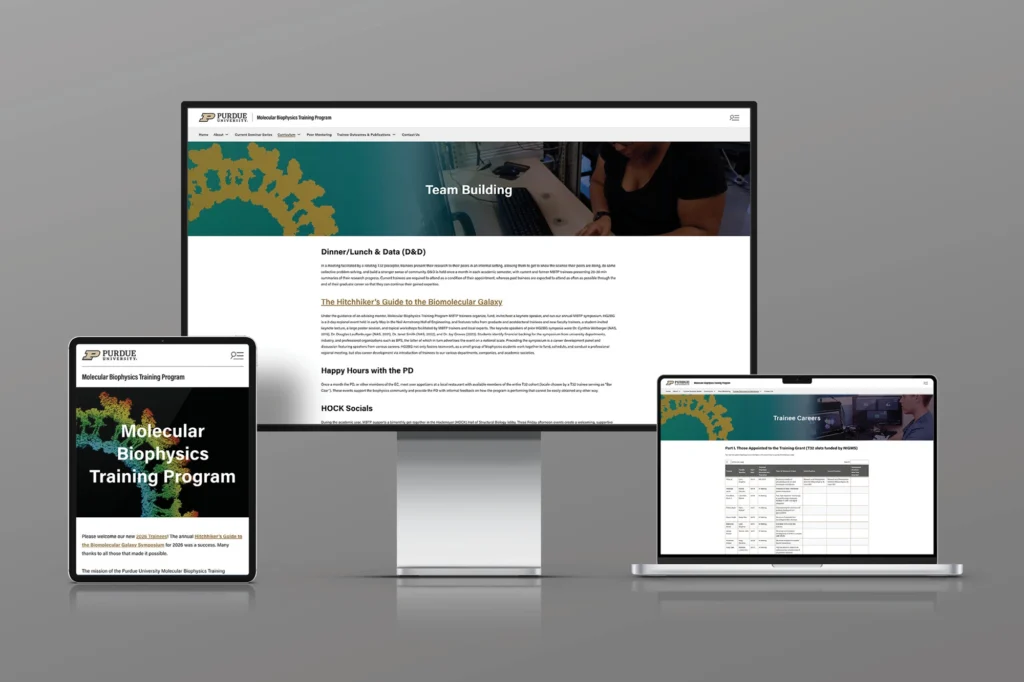
Molecular Biophysics Training Program
Training program sites are recruiting tools with an academic audience, which means credibility comes from clarity rather than polish. Faculty, research areas, and application requirements are the three things a prospective student came for. Everything else is secondary structure.
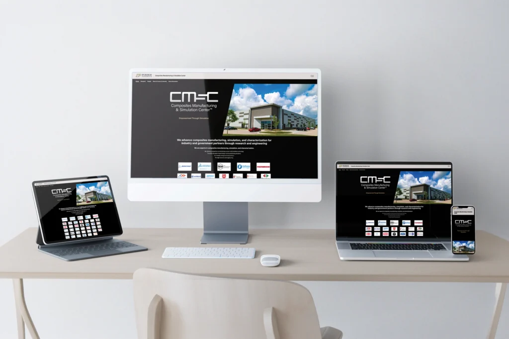
Purdue CMSC
The dark theme earns its place because the partner logos and facility photography have the contrast to hold against it. The industry grid, carrying names like Boeing and Airbus, is the center’s strongest credential, so it appears on the homepage rather than on a partners page. Leading with the roster is what a research center is actually selling.
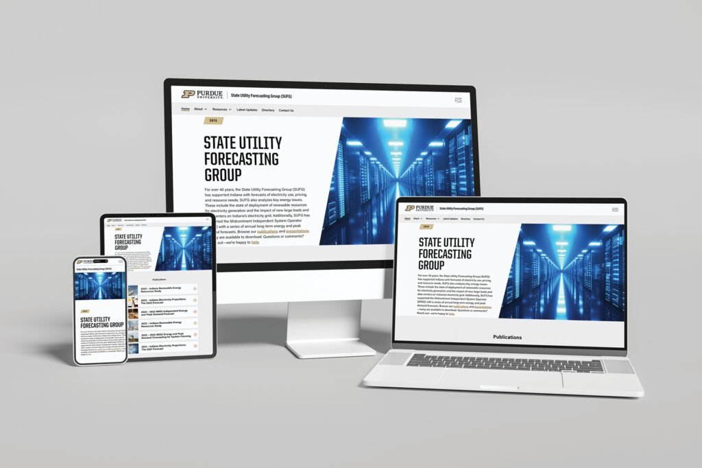
State Utility Forecasting Group
A forecasting group publishes long technical reports that have to stay findable for years. The build prioritized document architecture and search over visual novelty, because the audience arrives looking for one specific report rather than browsing. The data center imagery sets context without getting in the way.
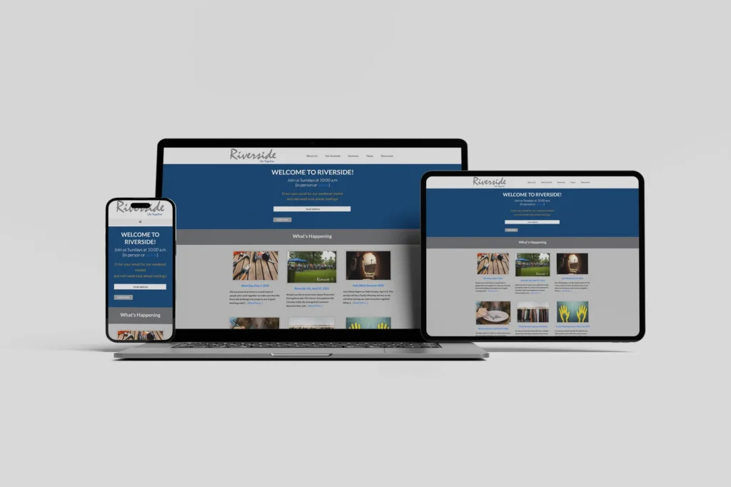
Riverside Covenant Church
Church sites serve two audiences at once: members checking a time, and visitors deciding whether to come at all. The news section and the signup form answer the first, and the header does the welcoming. Both land above the fold, so each audience is served on arrival.
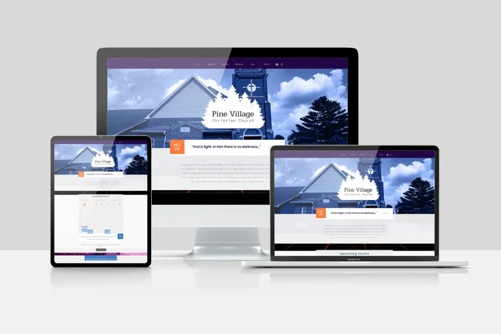
Pine Village Christian Church
A small congregation needs a site one volunteer can confidently maintain. The layout is deliberately shallow, so updating a photo or a scripture line takes only the panel it lives in. Longevity here was a design decision, not a hosting one.
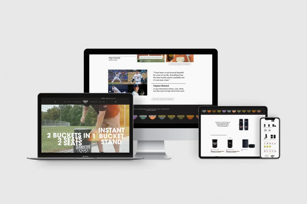
GrandStand Buckets
E-commerce for a single product built around one clear mechanism, two buckets in one. The homepage leads with what the thing does rather than what it is called, because nobody is searching the brand name yet. The athlete testimonial supplies credibility a new product cannot supply itself.
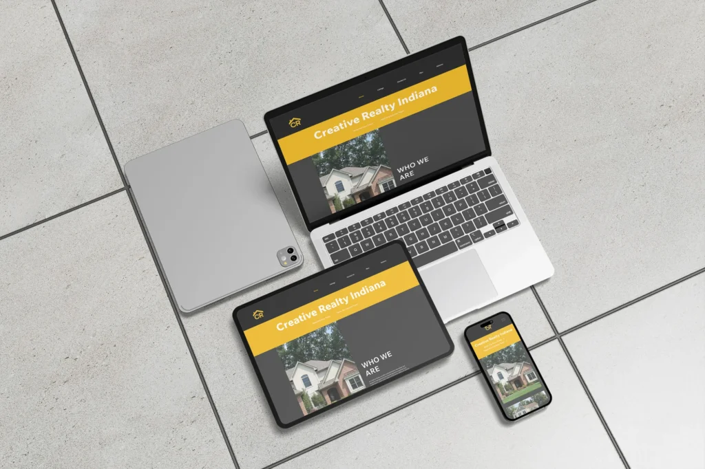
Creative Realty Indiana
Charcoal and yellow give a real estate site a palette that is not the usual blue, which matters in a category where every competitor looks alike. Property photography also needs a dark surround to hold its color. Differentiation had to come from the frame, since the listings themselves are shared inventory.
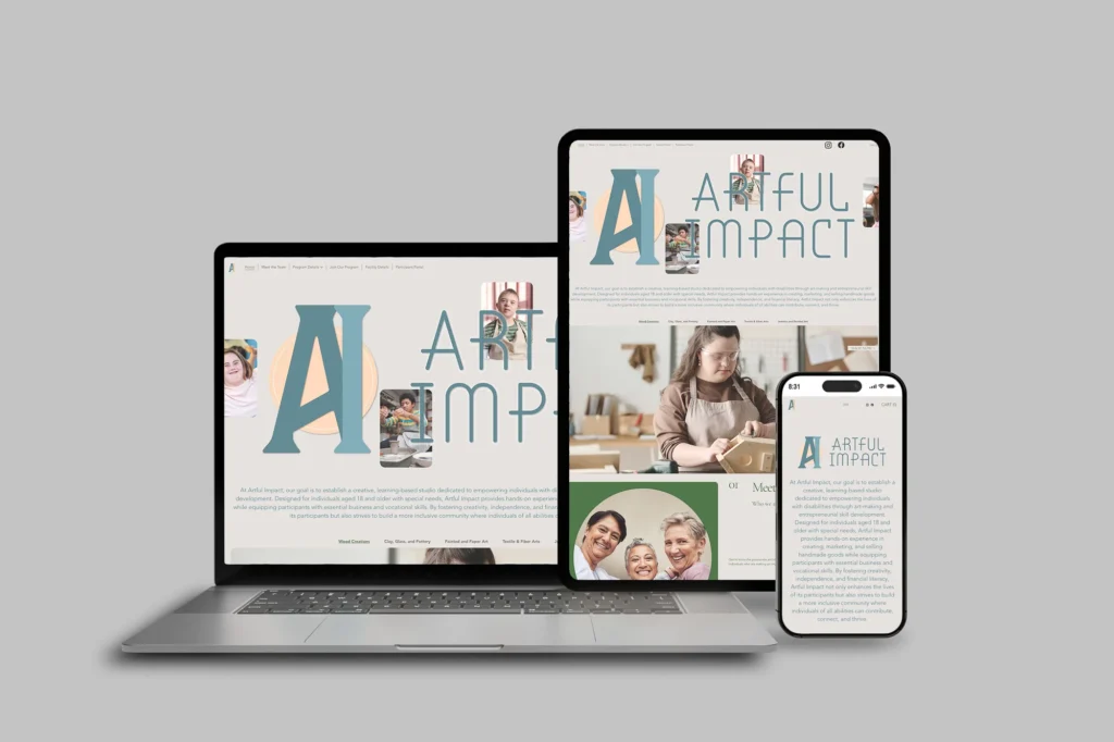
Artful Impact
Large letterform branding carries the identity so the photography can stay documentary. For a program serving participants with special needs, the images have to show the work being made rather than stage an impression of it. The category links keep the path to a specific program short.