Proposal Figures
Grant and research graphics reviewers can read at a glance
Proposal figures do a specific job under specific pressure. A reviewer is working through a stack of applications, and your figure gets a few seconds to establish what you are proposing and why it is worth funding. If it takes longer than that to parse, it has cost you rather than helped.
I spent 19 years at Purdue producing this work for NSF, DOE, DOD, and NIH submissions, alongside center-level proposals with 10 or more collaborating investigators. That means the constraints are already familiar: single-column widths, grayscale-safe palettes, type that survives at 8pt, and the reality that the figure gets finished three days before the deadline while the narrative is still moving.
The work here includes conceptual overviews, workflow and process diagrams, experimental schematics, data visualizations, and the summary figure that has to carry an entire aims page. Everything is delivered as vector art that scales without degrading, with an editable master file, so the next submission is a revision rather than a rebuild.
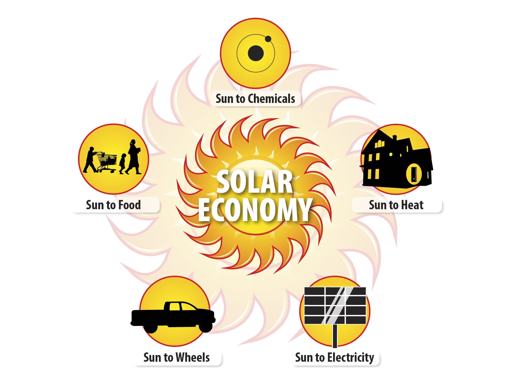
A single source and five destinations, drawn as a sun with five paths leaving it. Radial layouts hold when the branch count is small and the branches carry equal weight, which is the case here. Five spokes is right at the size where a ring still reads as a diagram at a glance.
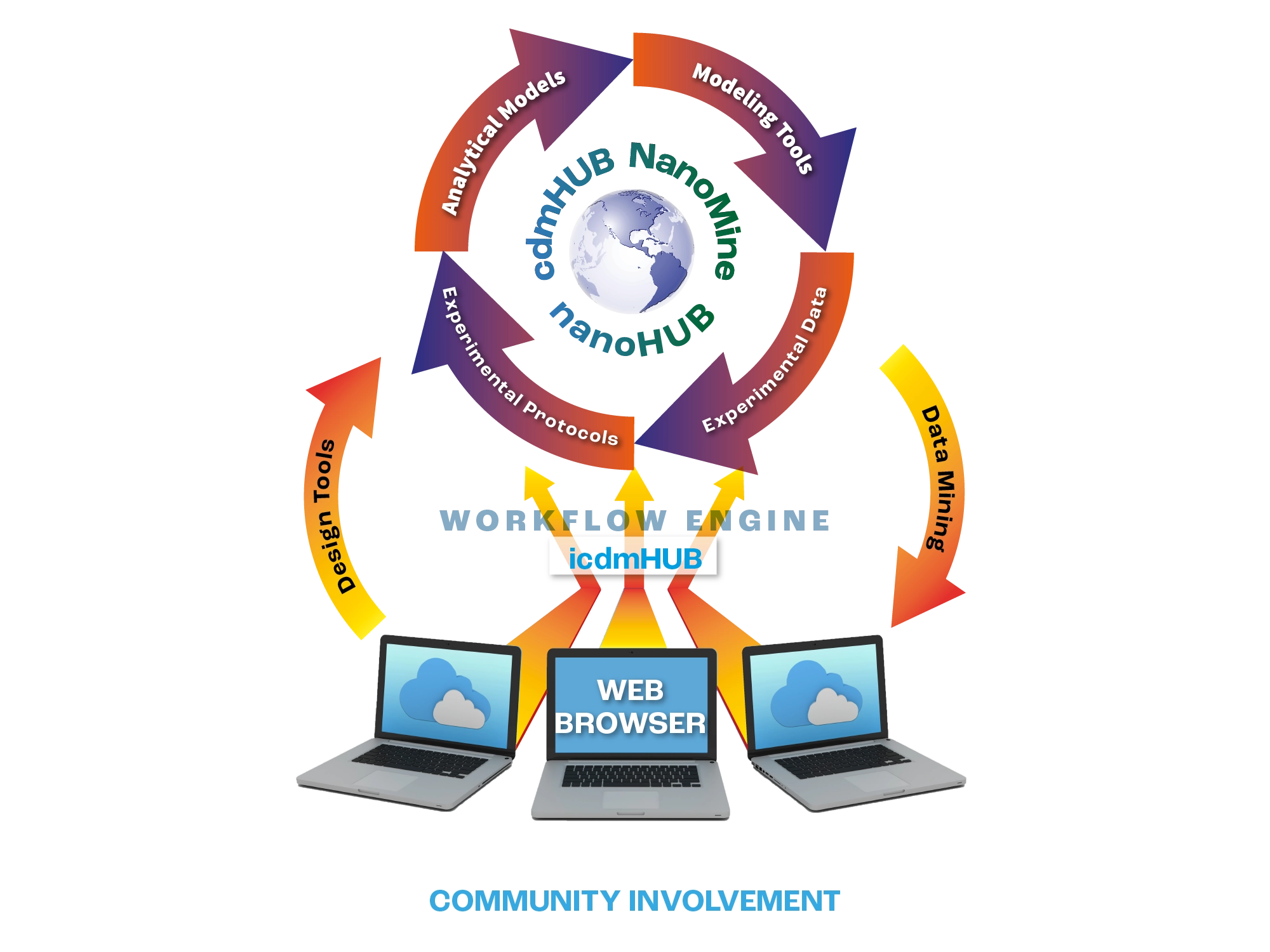
A cycle diagram gets read out of order, so every entry point has to work. Models, tools, data, protocols, and data mining sit around the platform at even intervals, letting a reviewer start at whichever stage matches their own work. The browser row at the bottom is where the abstraction resolves into something a researcher actually opens.
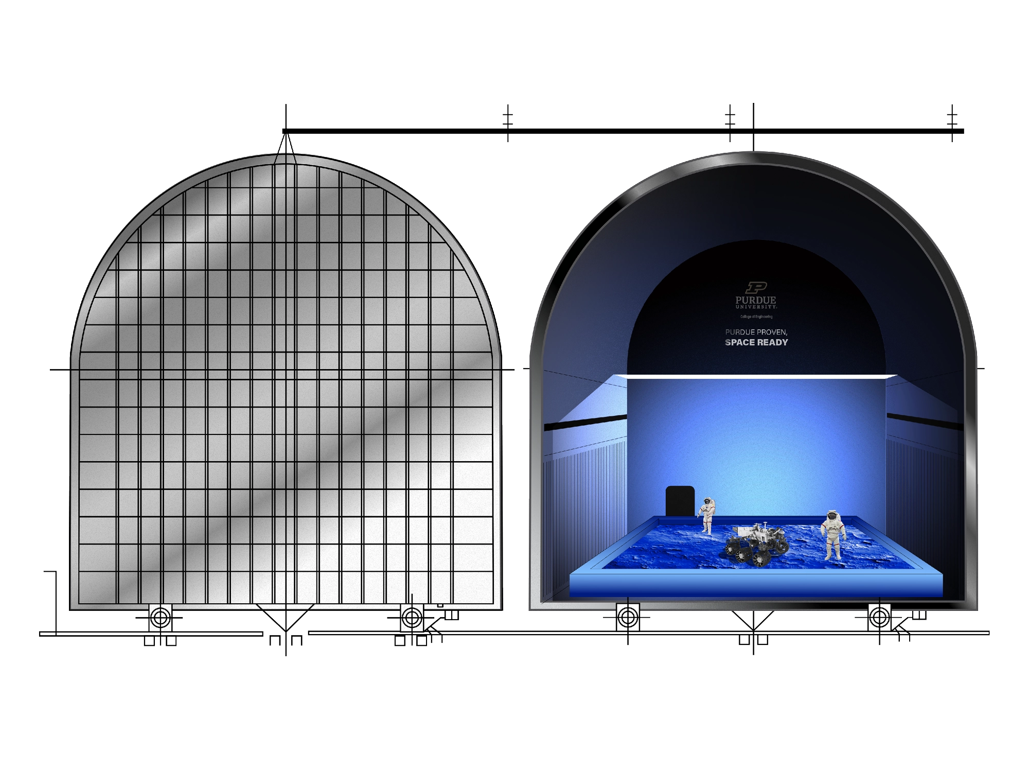
Sealed exterior at left, cutaway at right, which is the pairing that answers both questions a facility proposal raises: what gets built, and what happens inside it. The regolith bed, astronauts, and rover establish a scale that an elevation drawing cannot supply on its own. The banner is doing recruitment work inside the same figure.
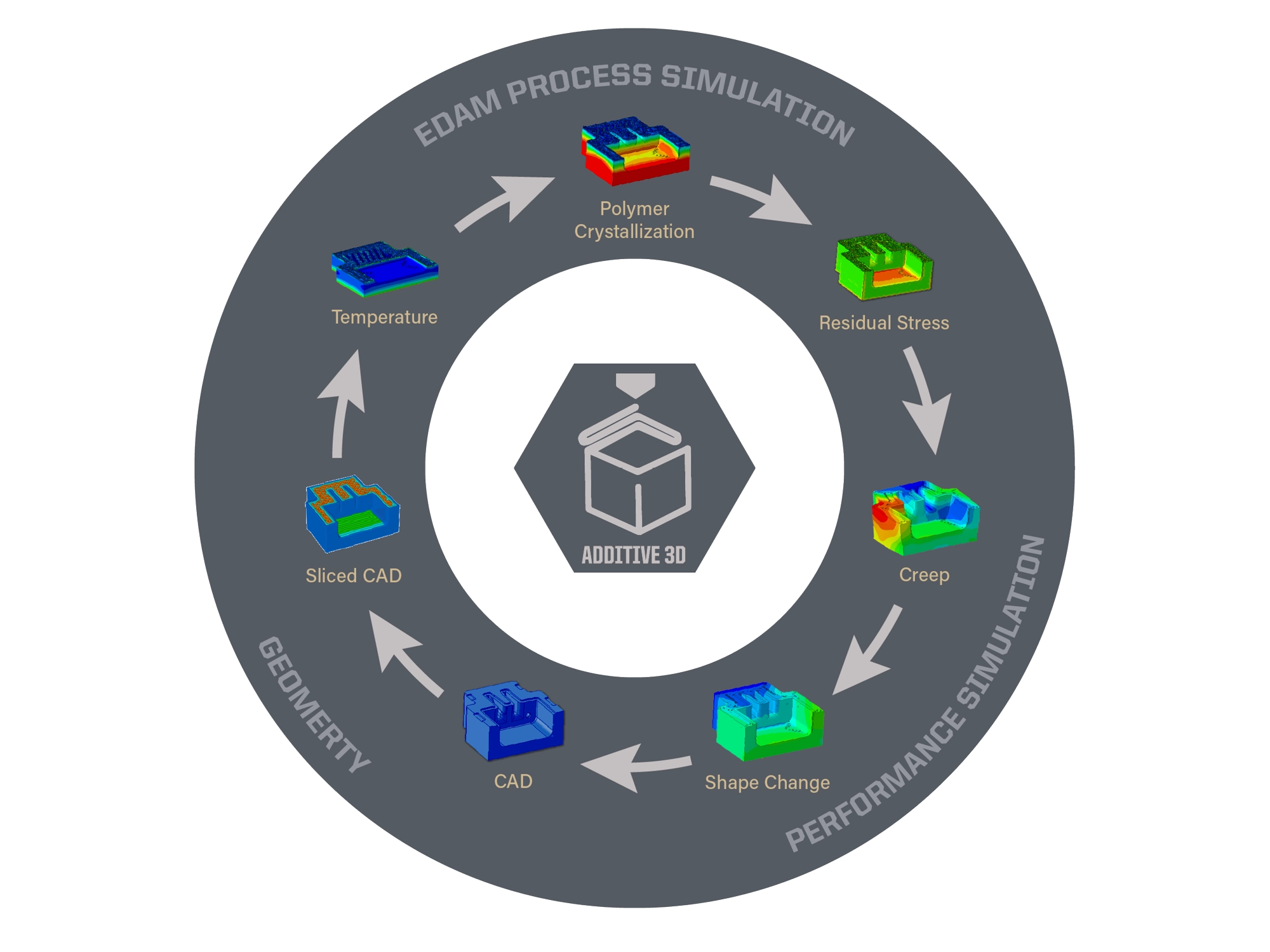
Held in gray so the color-mapped simulation results are the only saturated elements on the page. Crystallization, residual stress, creep, and shape change group under process, performance, and geometry, which gives a reviewer three handles instead of eight. Grouping is what makes a dense cycle survivable.
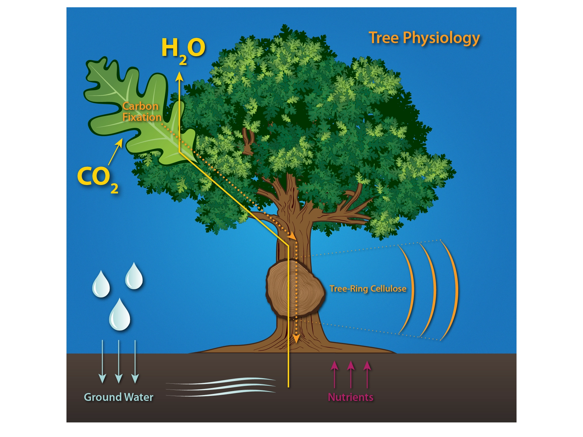
Above ground and below ground in one frame, which is the point of the figure. Carbon fixed in the leaf travels down through the trunk into tree-ring cellulose, while water drawn up from the ground is released back out as vapor at the leaf — two separate paths sharing one trunk. The blue field keeps labels legible where the drawing is busiest.
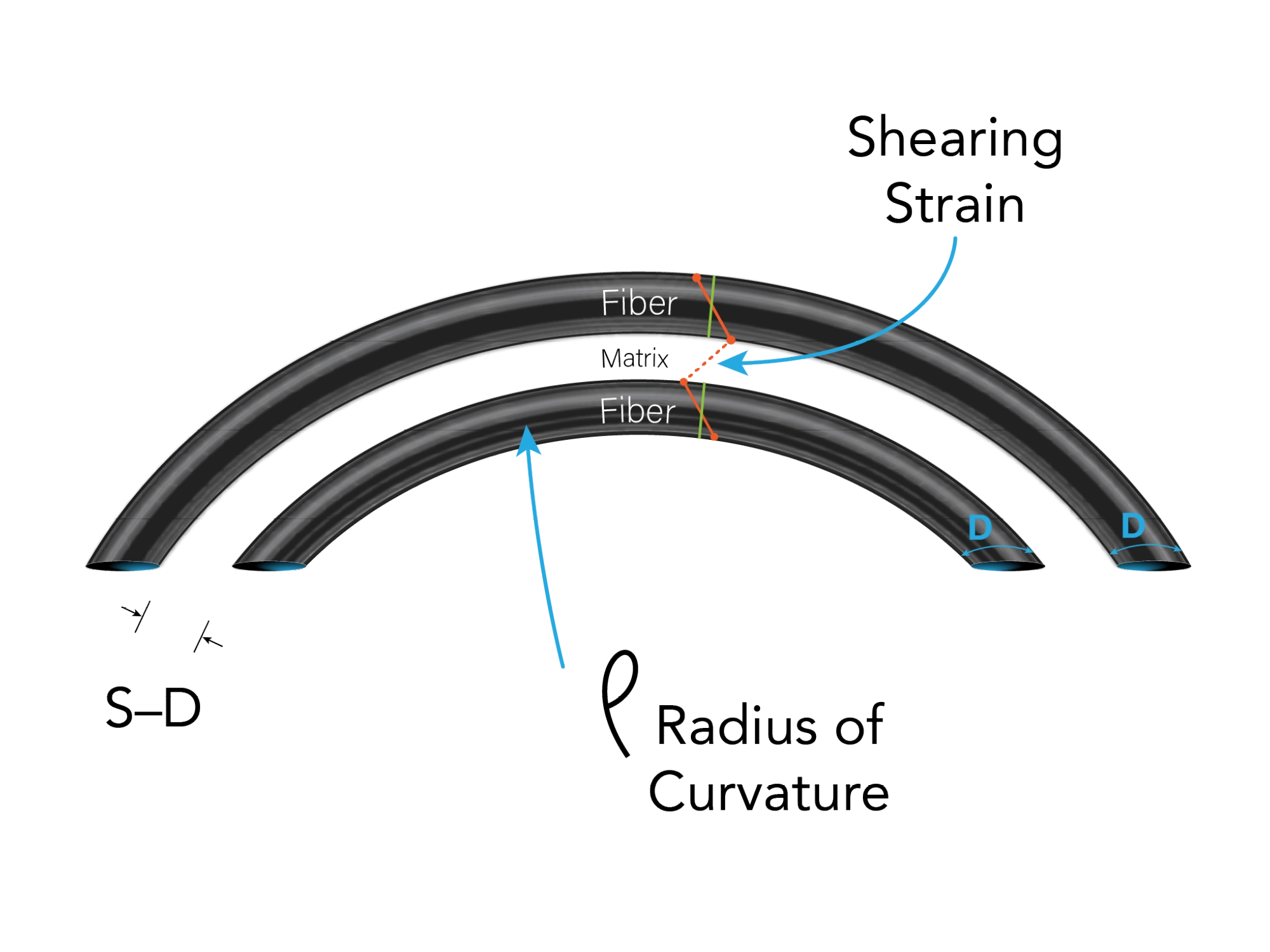
A journal figure, where correctness comes before appeal and the whole thing has to survive being printed at column width. Fiber tows, matrix, shearing strain, and radius of curvature are each labeled once, with leader lines short enough not to tangle at reduction. The restraint is a technical requirement rather than a stylistic preference.
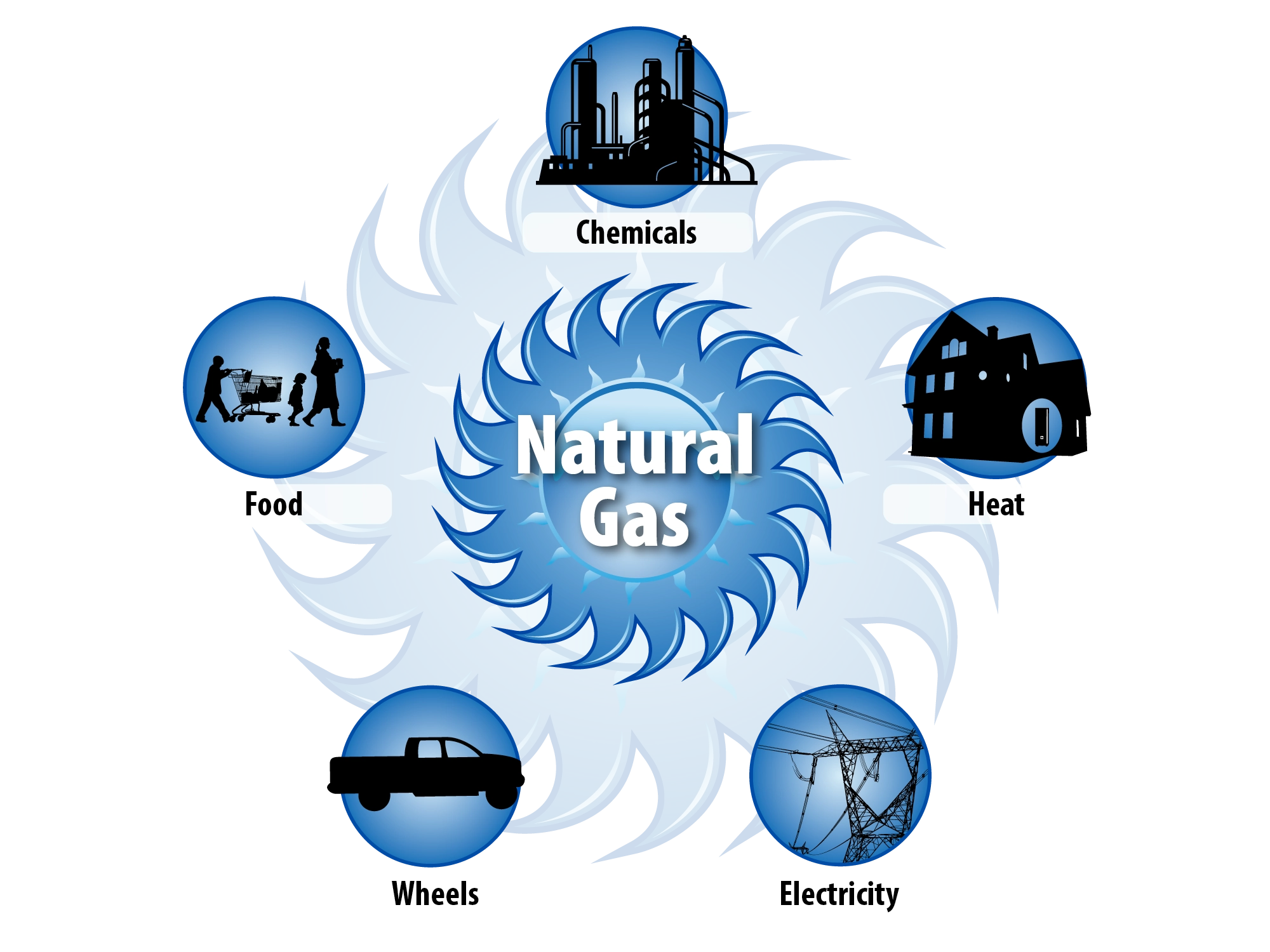
Built as the direct counterpart to the solar figure, with the same five endpoints and the same geometry so the two can sit side by side in a proposal. Only the center and the color change. When a reviewer is asked to compare two pathways, the comparison has to be structural rather than verbal.
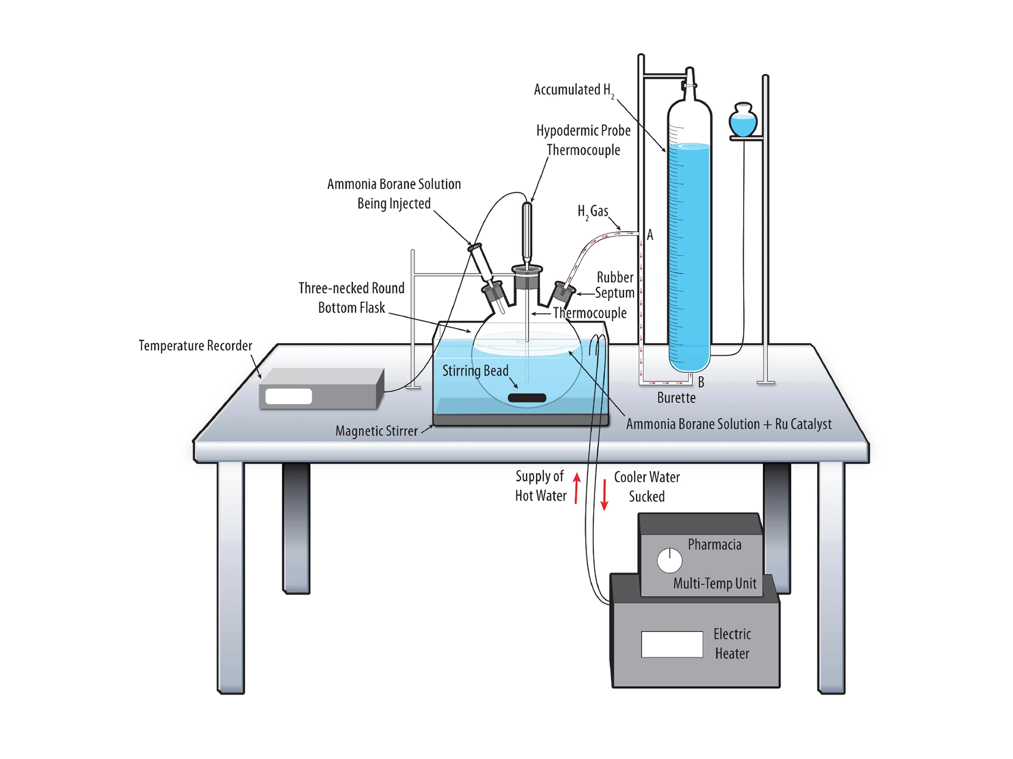
Apparatus illustration is documentation before it is decoration. The flask, thermocouples, burette, and heated bath sit in correct working relationship, so another lab could rebuild the setup from the figure alone. Drawing it rather than photographing it removes the clutter of a real bench, which carries no information a reviewer needs.
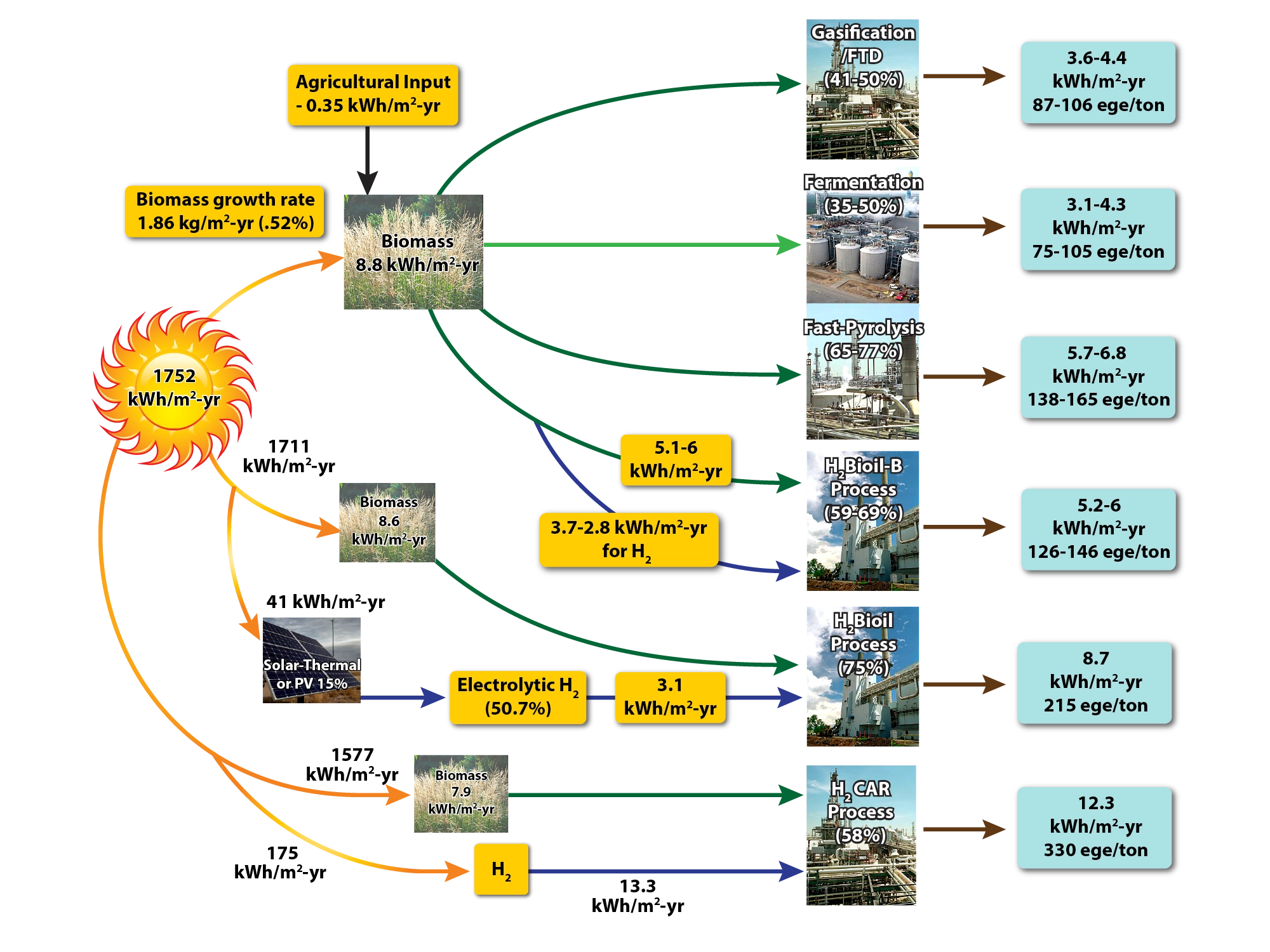
Six pathways compared on two units at once, kilowatt-hours per square meter per year and gasoline-equivalent gallons per ton. Carrying both metrics lets a reviewer check the claim against whichever one their panel favors. A comparison that survives either unit is the one worth putting in front of a panel.
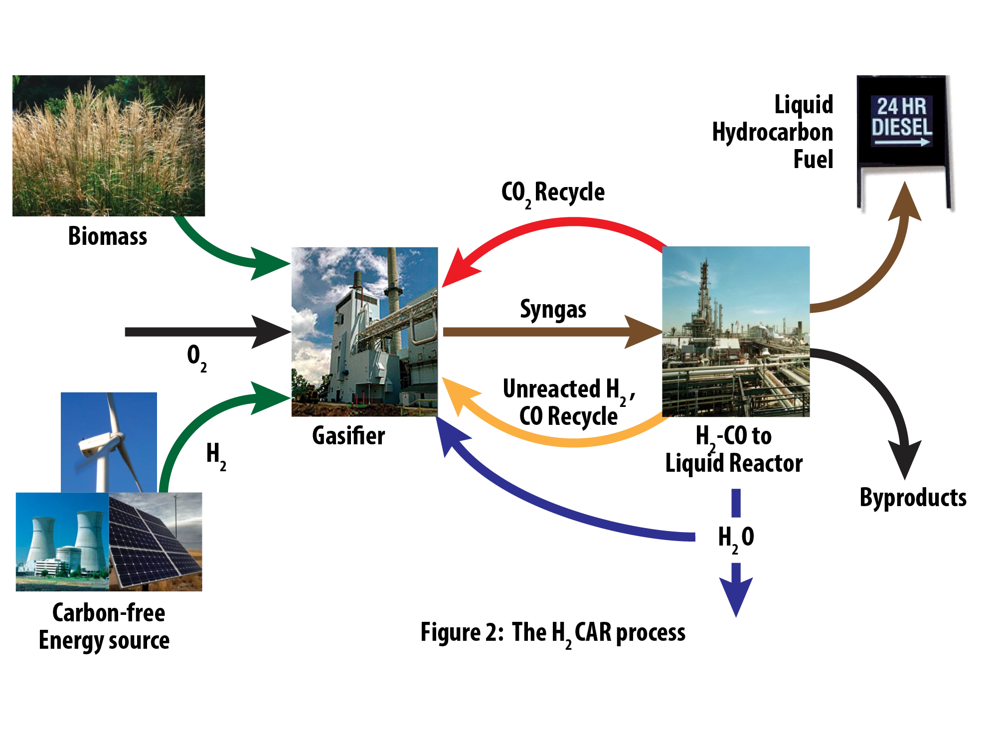
The recycle loops are the reason the figure exists. Carbon dioxide, syngas, and water returning to the process is what makes the pathway defensible, so those paths are drawn as clearly as the forward flow. Showing the returns represents the system at its real complexity.
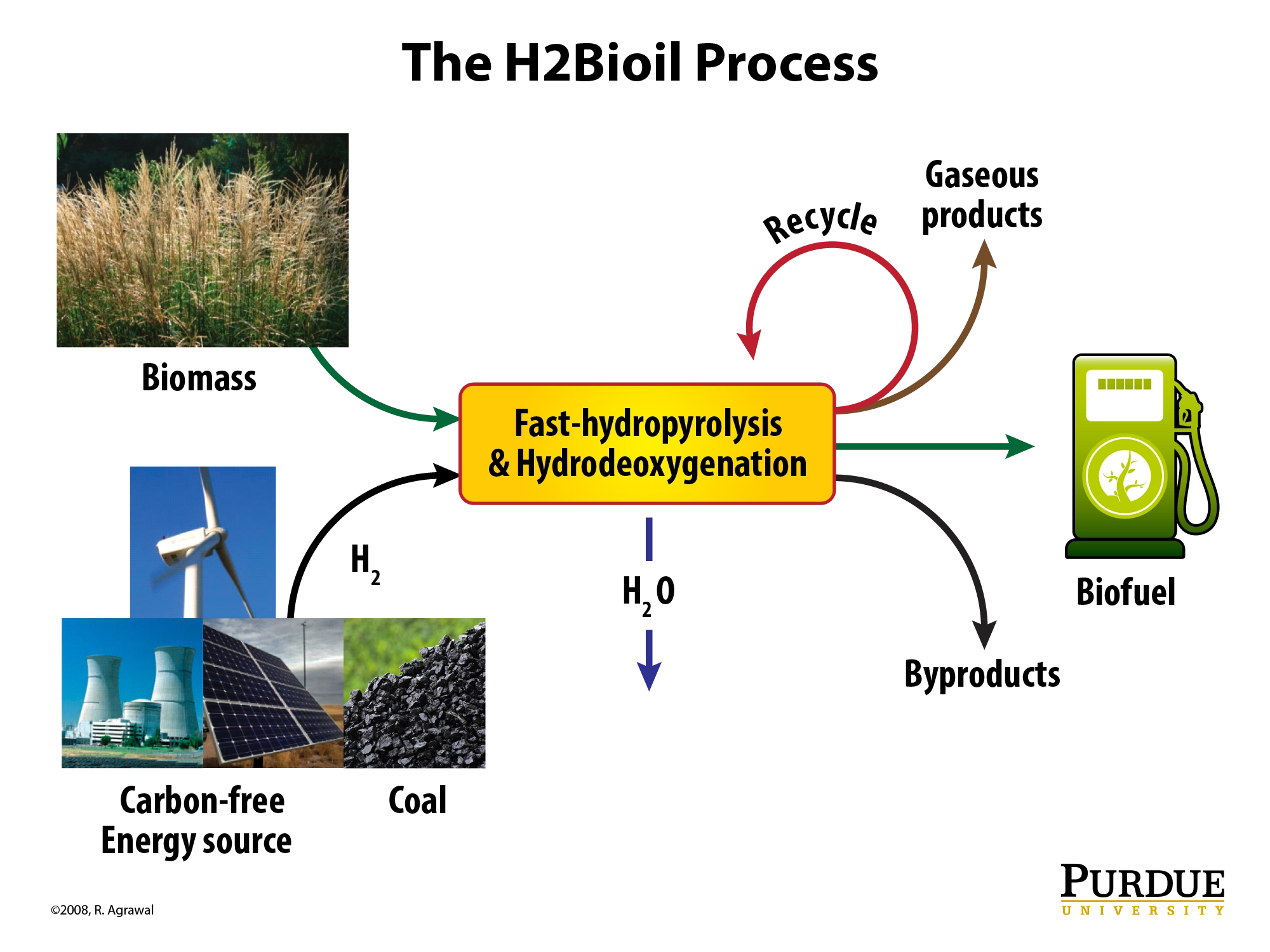
Photographs of switchgrass, wind, nuclear, solar, and coal do work no diagram can: they make the feedstock and energy inputs concrete before the process boxes are read. Holding the images to a consistent size and tone lets them sit inside a schematic without breaking it. The abstraction only earns its keep once the reader believes the inputs are real.
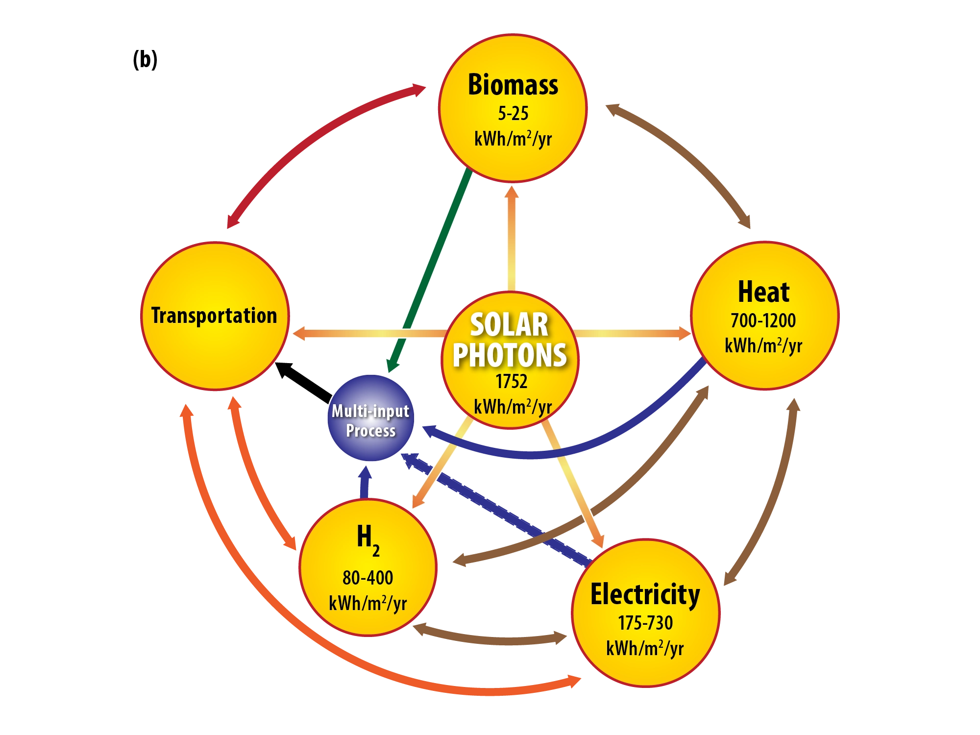
Everything is expressed in one unit, kilowatt-hours per square meter per year, which is what makes five unlike outputs comparable at all. The center is where inputs converge and the ring is where they resolve. Choosing the common unit is most of the design work in a figure like this.
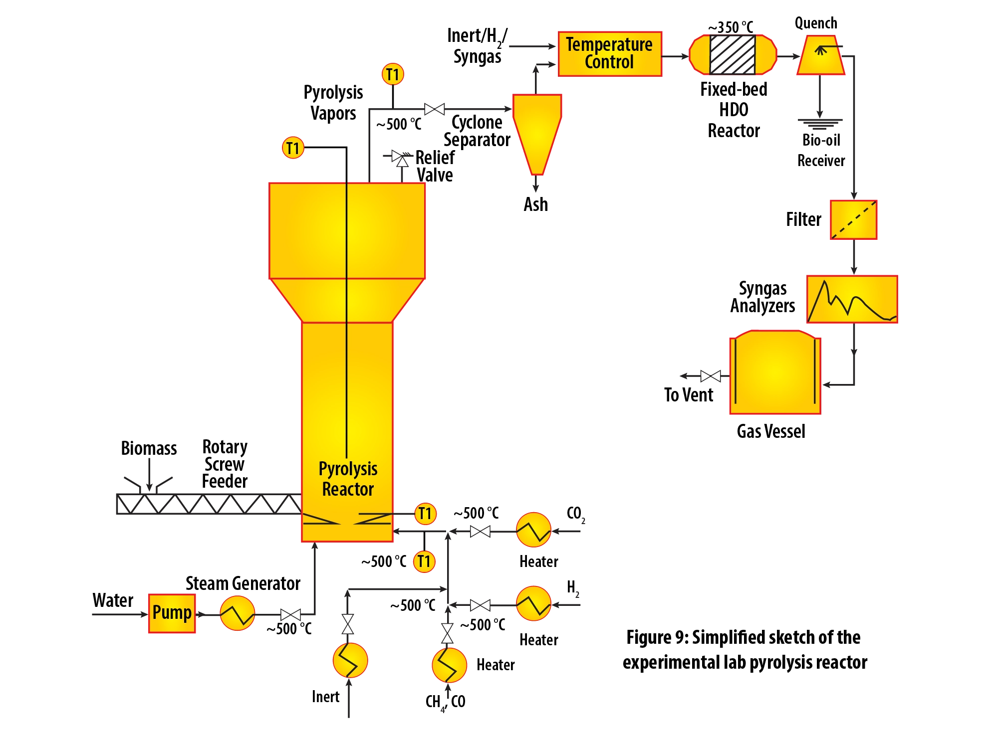
Feed pump through to collection vessel, drawn in the physical order the material moves. Equipment schematics should read as a route, so nothing is placed for visual balance if it breaks the sequence. The quench and filter carry the most detail because they are where the process gets questioned.
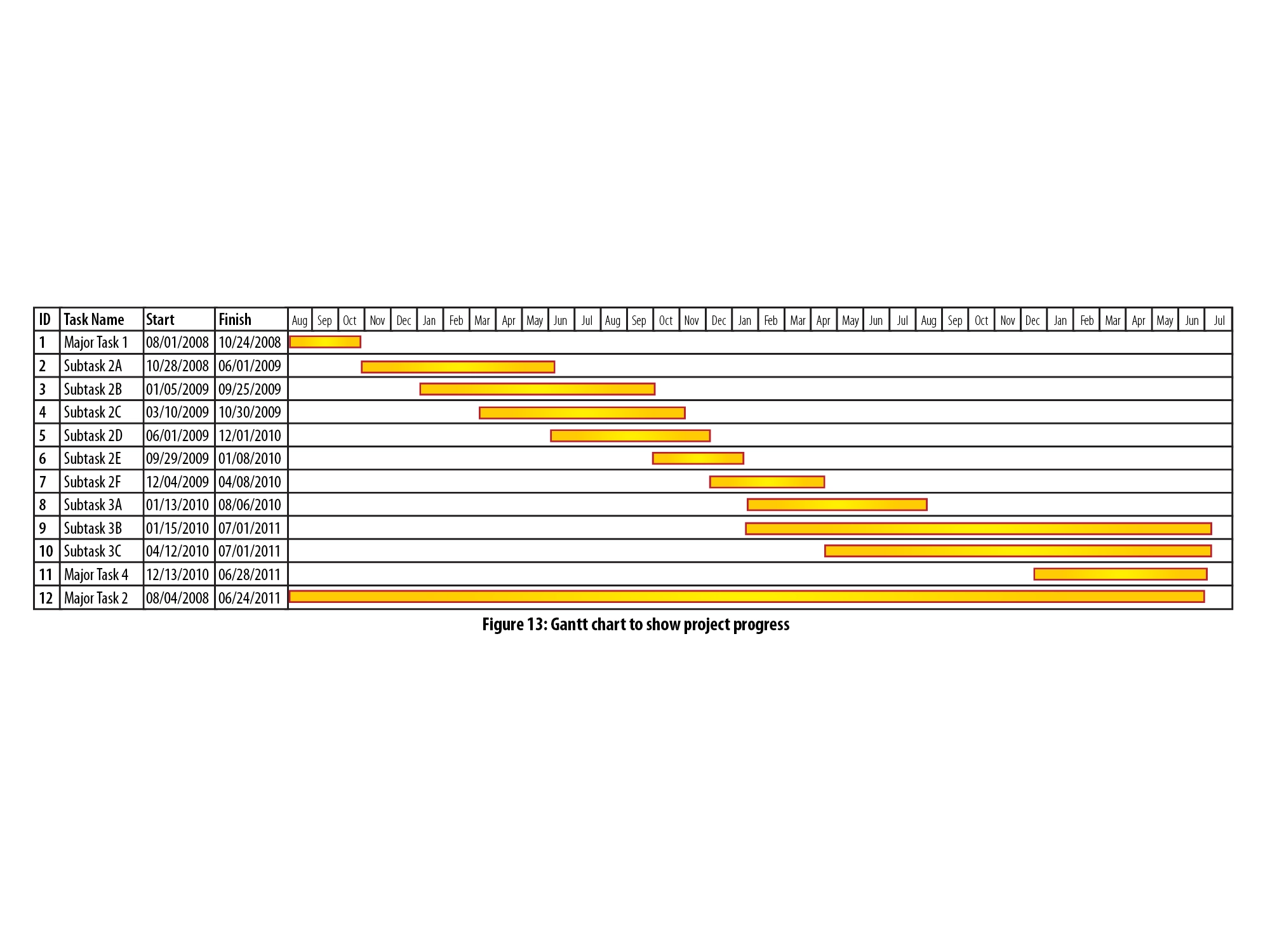
Twelve tasks and subtasks across nearly three years, built to be understood at a glance. Gold bars carry duration, and the naming alone does the work of showing hierarchy — major tasks and subtasks read as a flat, single-column list rather than a nested outline. Schedules get skimmed, so this one is built to reward skimming.
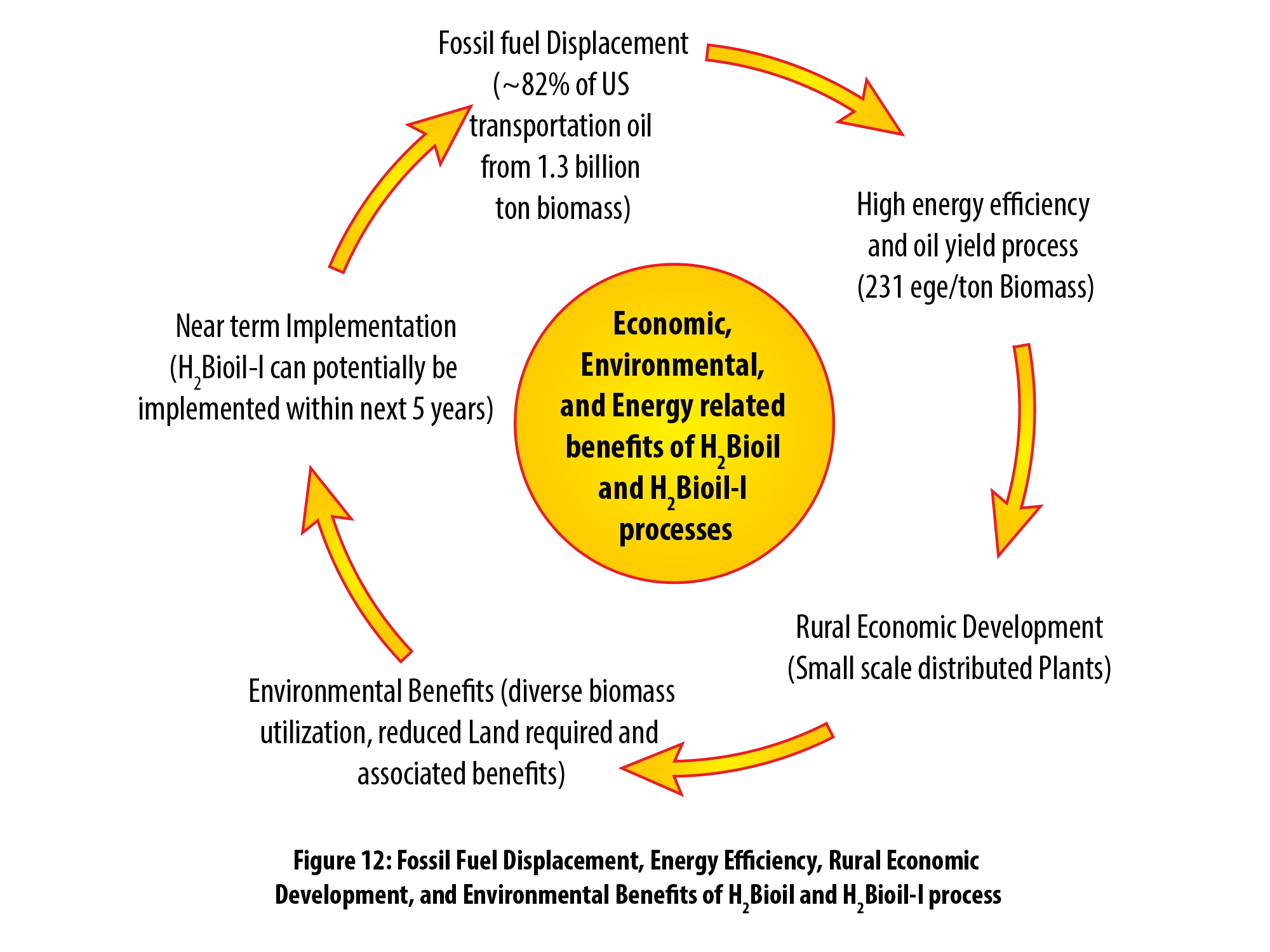
Economic, environmental, and energy benefits placed on one ring so that no single category reads as the primary claim. Fossil fuel displacement, process efficiency, rural development, and near-term implementation are four arguments a funding panel weighs separately. Giving them equal position is a deliberate rhetorical choice.
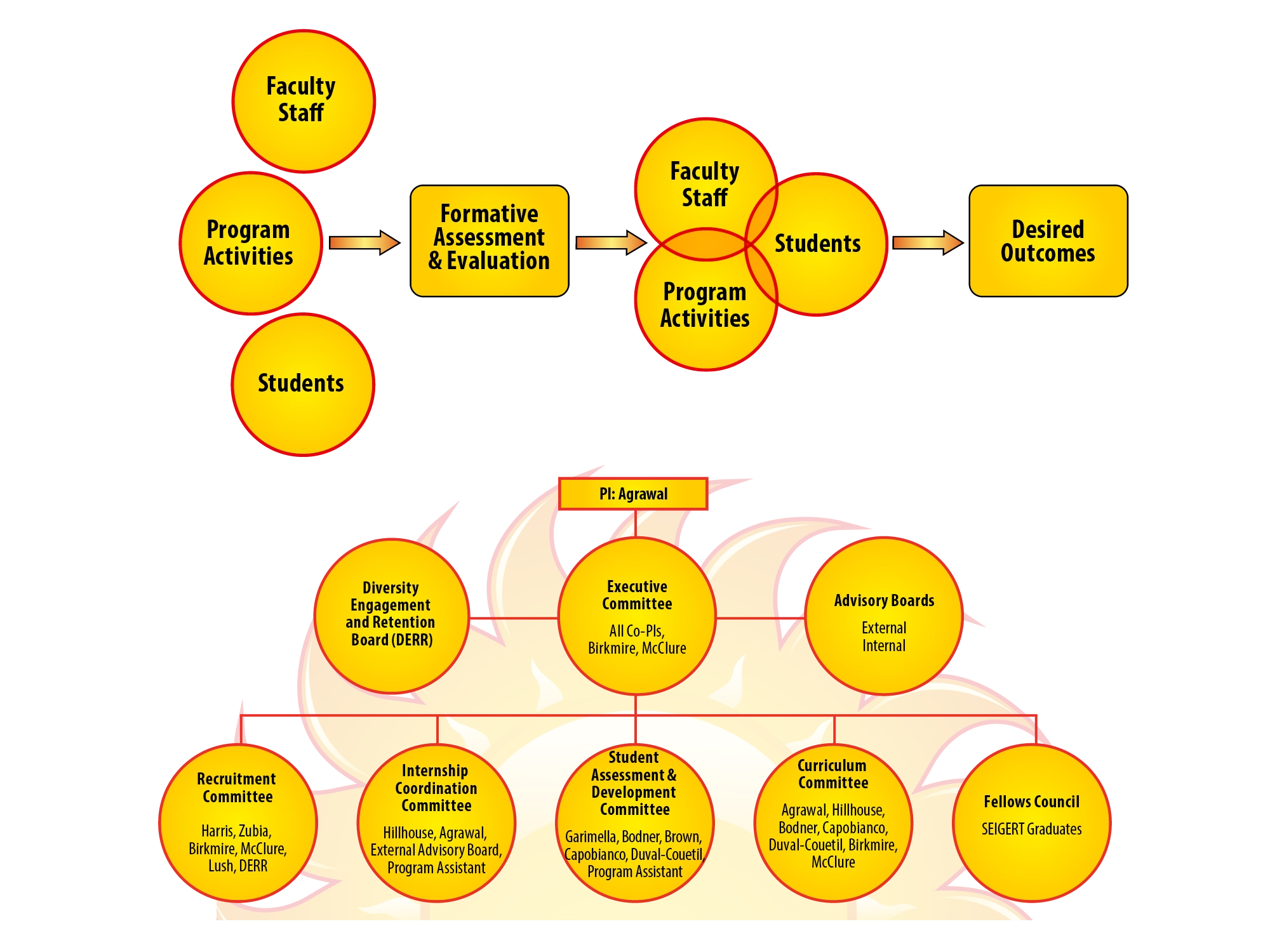
Evaluation flow above, organization chart below, because reviewers ask who is accountable immediately after they ask how it will be measured. Stacking the two keeps the answer on a single page. The chart runs from principal investigator down to the committees that do the work, which is the part that gets scrutinized.
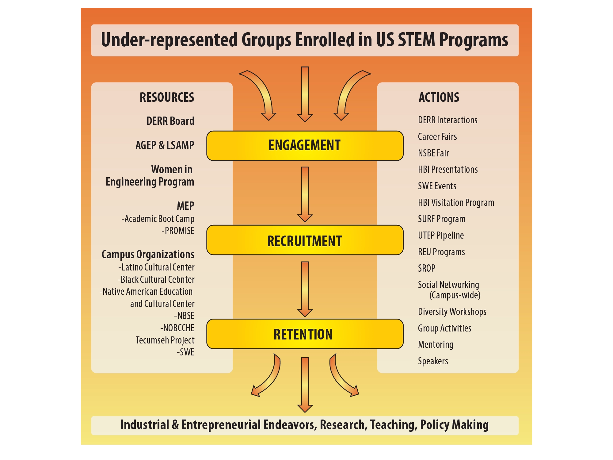
Engagement, recruitment, and retention read left to right as one path, with campus resources on one side and outreach actions on the other. Splitting inputs from actions keeps the middle column clear enough to follow. Broadening participation plans are judged on whether the mechanism is specific, so the mechanism gets the center.
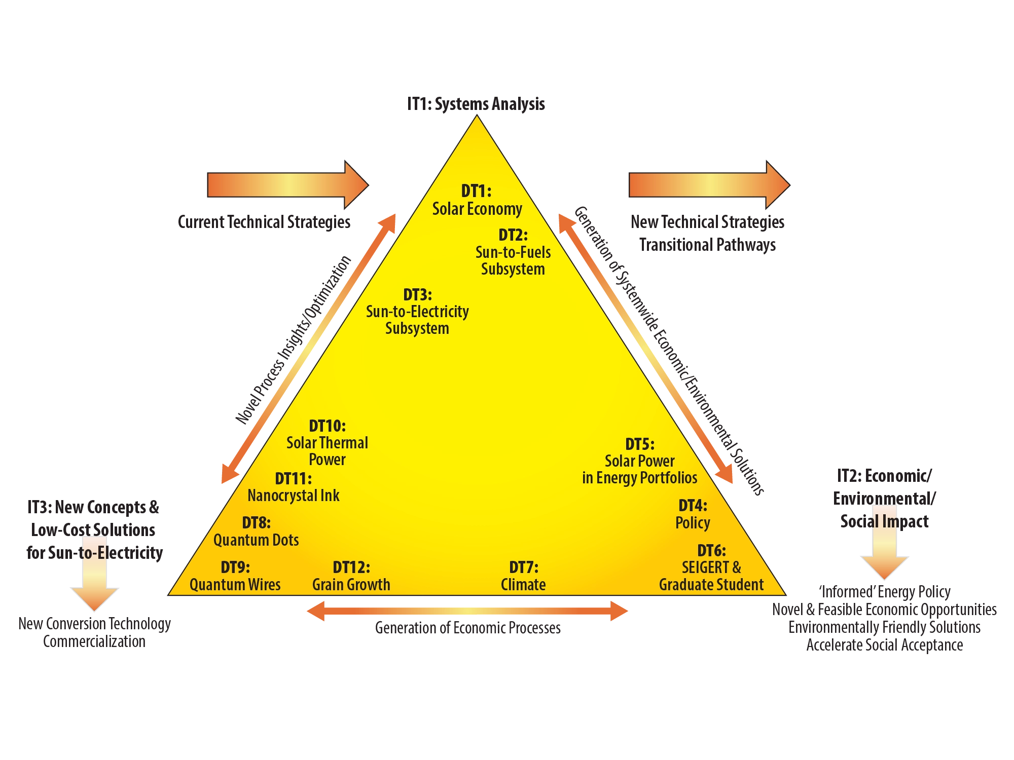
A triangle sorts by generality without a legend having to say so. Solar economy and sun-to-fuels sit at the apex while the specific dissertation topics spread along the base, showing a training program’s breadth and its shared premise in one shape. The shape carries twelve items in a way a list could not.
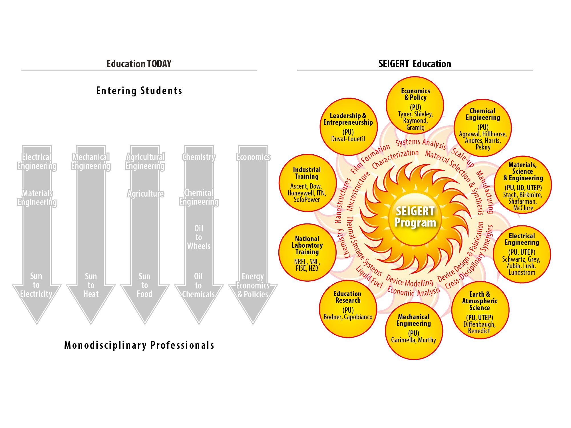
The figure argues by contrast: separated disciplinary columns on one side, the same participants arranged radially on the other. Showing the problem beside the proposed structure is more persuasive than describing either alone. Departments, faculty, national laboratories, and industry partners all appear in the second half, which is the point being made.
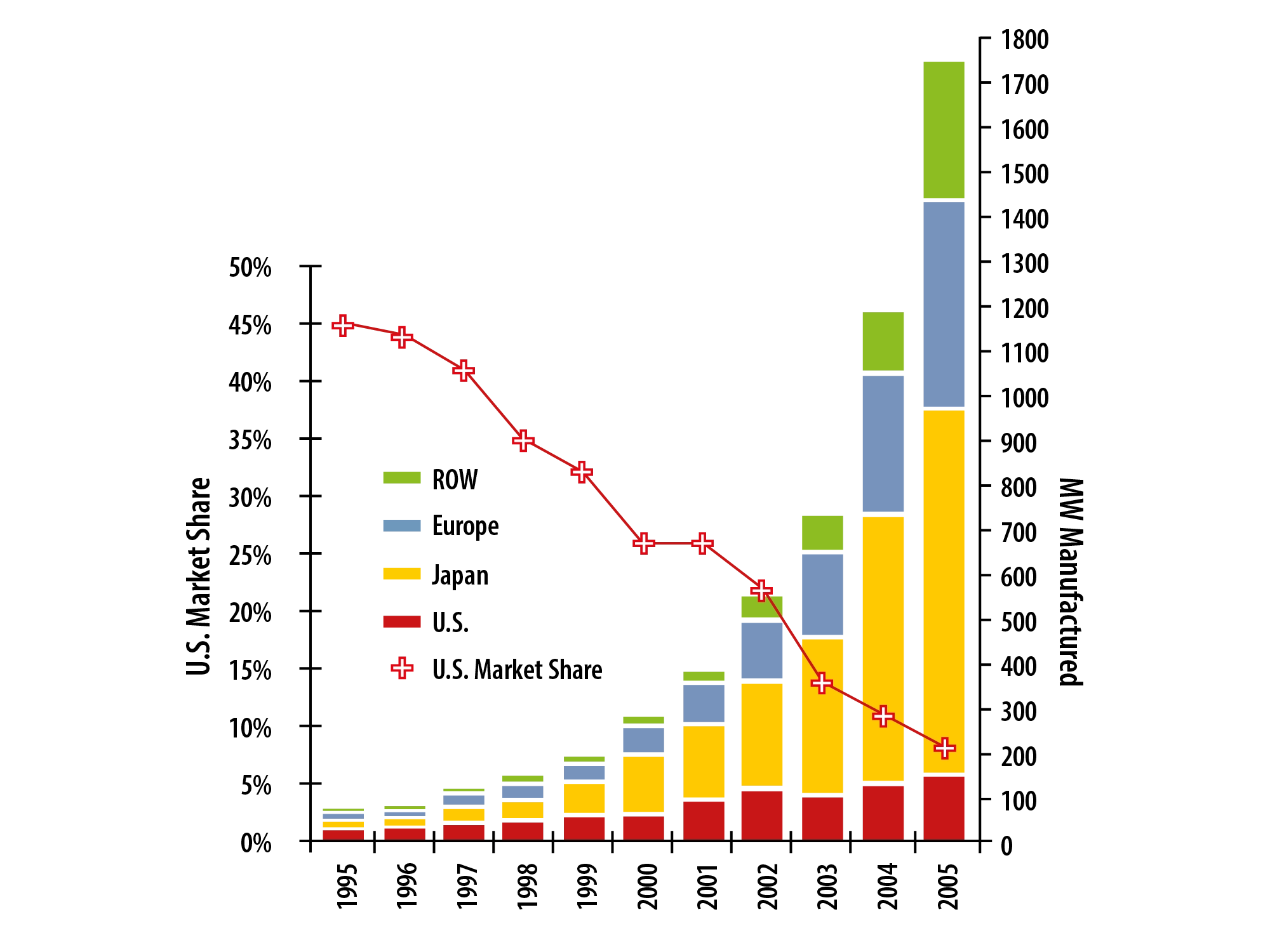
Two stories in one chart: production by category as stacked bars, and declining US market share as a line across the top. The line is the argument and the bars are the context, so the line takes visual priority. A dual axis works when one series is clearly subordinate, and here the hierarchy is unambiguous.
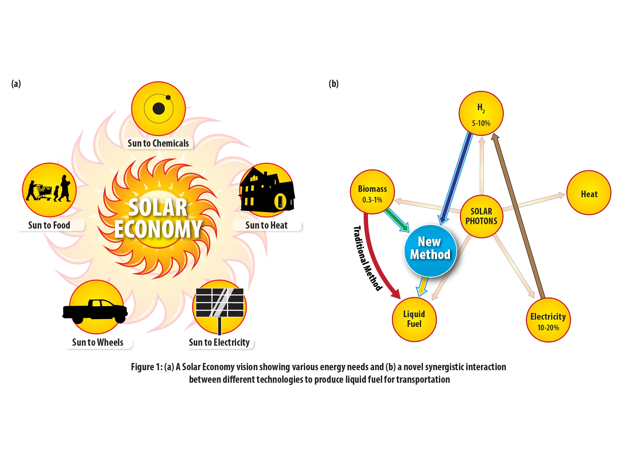
The solar economy sun returns as the left panel, which lets the new conversion route on the right be read as an addition to an established picture rather than an unfamiliar claim. Reusing a figure the panel has already absorbed is a legitimate way to spend less of their attention. The highlight does the rest of the work.
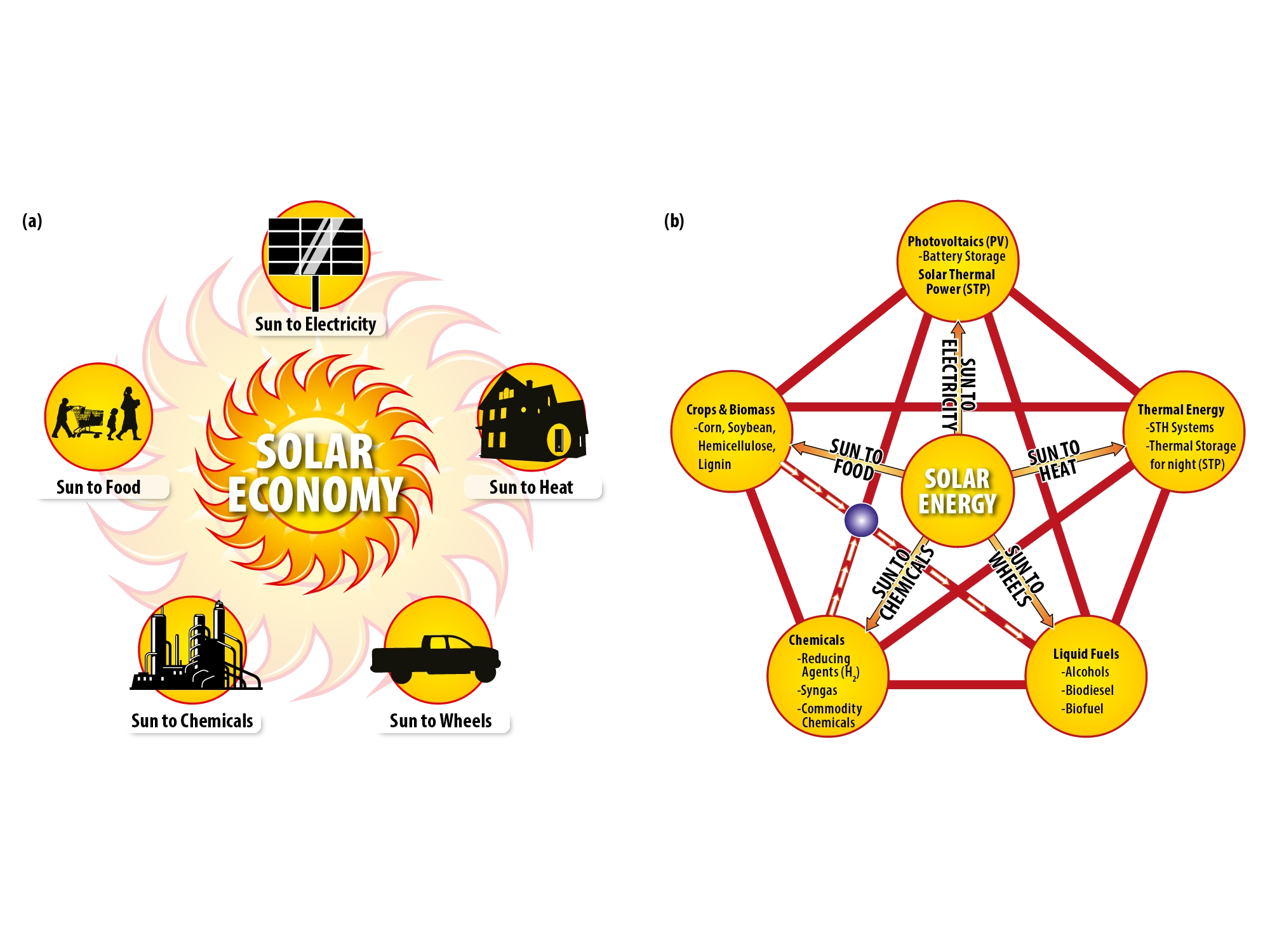
Same left panel, different right panel, built for a proposal making a different case. Keeping the anchor figure fixed while the second panel changes is what turns a set of one-off graphics into a family. Photovoltaics, thermal energy, liquid fuels, chemicals, and crops each get a vertex instead of a line of body copy.
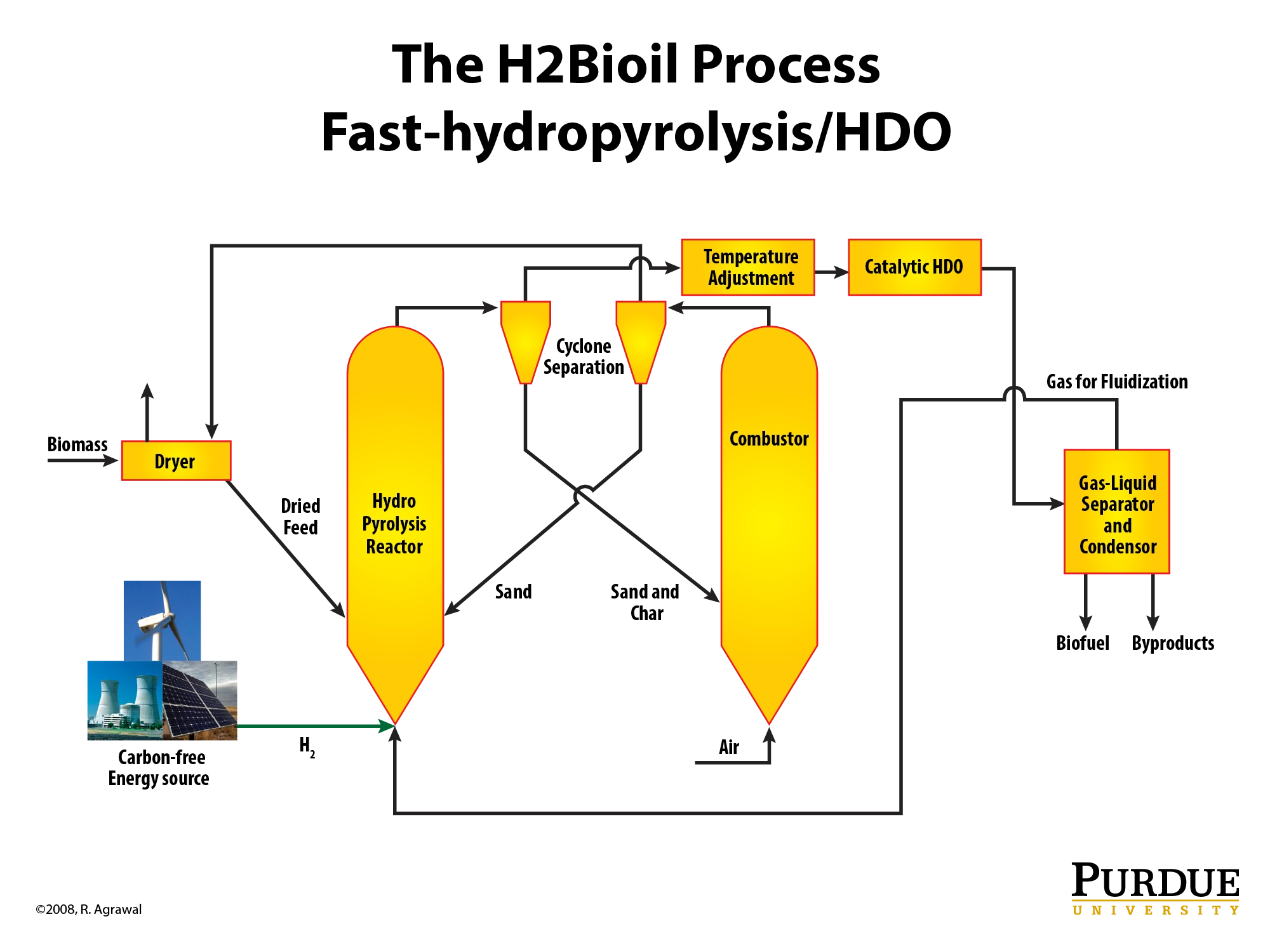
Every vessel is named and placed in sequence, from dryer through hydropyrolysis, cyclones, combustor, HDO unit, and separator. Naming the equipment rather than abstracting it into boxes signals that the process has been specified rather than sketched. Reviewers who know the field read that difference immediately.
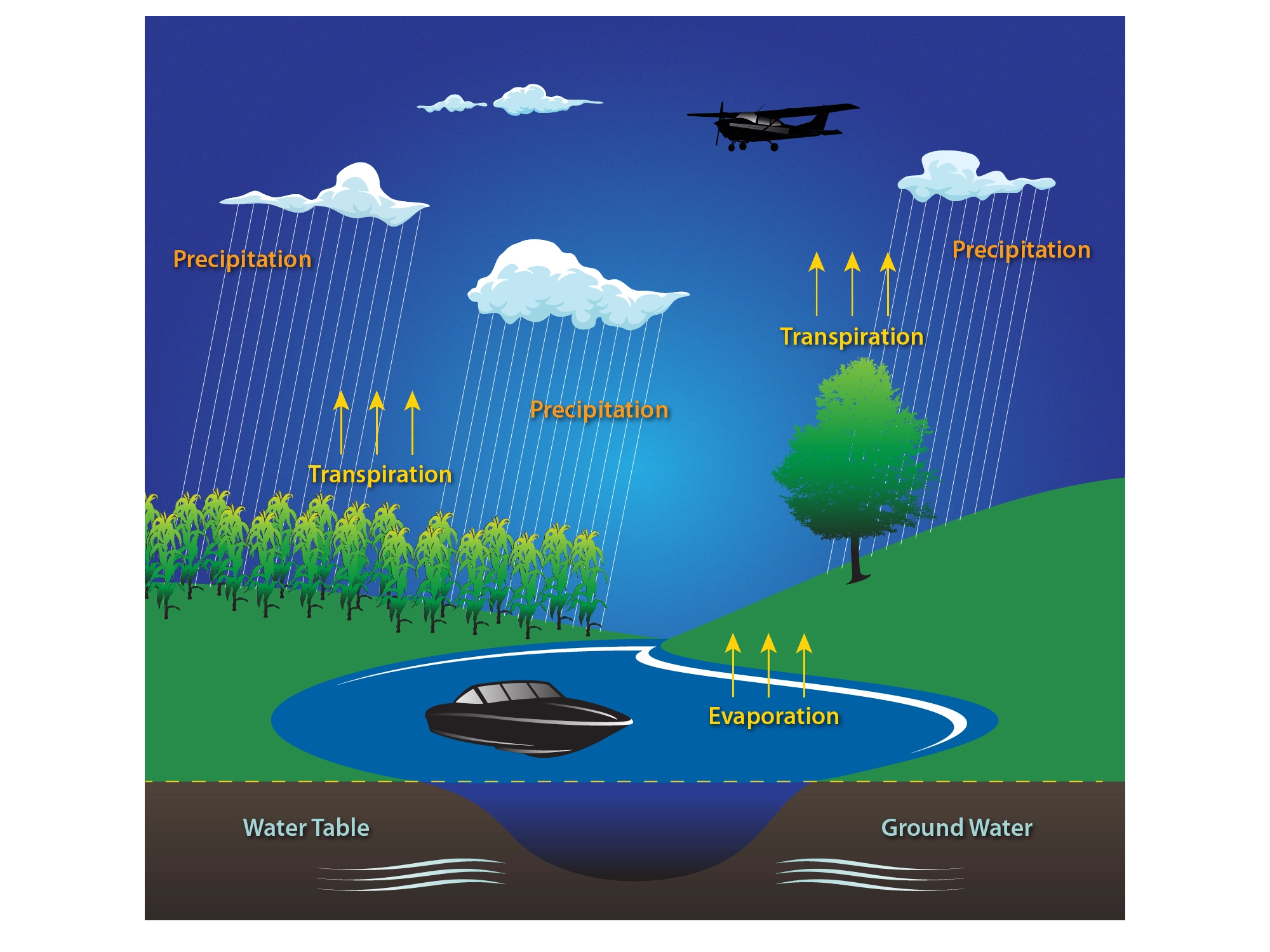
Precipitation, transpiration, evaporation, and the water table drawn as one continuous scene rather than as four labeled stages. The yellow arrows carry the motion so the landscape can stay quiet underneath them. A cornfield, a tree, and a lake put three different land uses in a single frame, which is usually the argument a figure like this is making.